I love merchandise, and I’m not ashamed to admit it. Especially if it’s book-related. Lately, I’ve found myself drawn to the plethora of items sold by Penguin that recall the nostalgia of their classic binding. You know which one I mean – the three horizontal stripes, famously orange, with the title stamped boldly in the middle. I have the coffee mug (Wuthering Heights, thank you very much). I have the box of post cards (one hundred book covers!). And of course, I have plenty of the books. Penguin has done a remarkable job over the years using their distinctive designs as a marketing tool. They have evolved from the original three-stripe cover, but their systematic method of different bindings for different editions is still effective, and the original design is now imbued with enough nostalgia to have produced a whole line of products sporting those orange stripes.
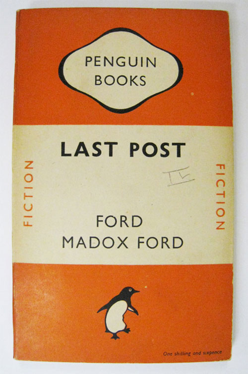
Penguin Books was founded in 1935 by Allen Lane, who saw a gap in the market for affordable editions of classic literature. The original cover was designed by Edward Young, and used colors to indicate the subject. Orange for fiction, green for crime, dark blue for biography, cerise for travel and adventure, and red for plays (Baines 2005). Other colors were added over time, and although the layout changed, the color system remained. After its founding in 1935, Penguin’s reputation and popularity soared. The affordable, lightweight paperbacks provided an opportunity for the masses to broaden their horizons, and the fresh, modern design of the covers drew in new customers. The thigh pocket of the army uniform was the perfect size and shape to fit a Penguin book, and “at the more intellectual end of the readership…a Penguin peeping from a pocket signaled serious-minded interests and drew like-minded readers together” (Rylance 2005, 49).
As the company expanded and began to publish books across the ocean in America, new cover designs were introduced. The scope of subjects published was huge; during the war, handbooks with titles associated with the war effort such as The Penguin Knitting Book and Soft Fruit Growing appeared, and by 1943 the handbooks were their own series (Baines 2005). They were given their own distinctive binding, which featured a center panel with the title, and a border filled with illustrations related to the title. In the 1950s, the series expanded beyond the war effort to include titles like Paint Your Own Pictures and The Game of Chess.
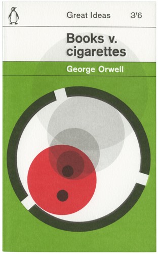
The covers continued to evolve through the 60s and 70s, becoming more graphic-heavy and sometimes using photography rather than illustrations. Subjects such as cookery, science fiction, and poetry made their way into the print runs, and the designs changed again and again.
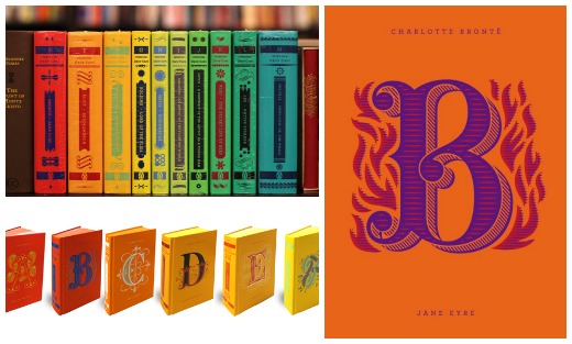
Today, the covers are not as systematic – especially when it comes to fiction. The fiction market is incredibly competitive, and much relies on a good cover design. But not for nothing is Penguin one of the largest and most successful international publishing corporations; in addition to their trade covers, they consistently produce collectable special editions. Their hardback classics are enticing works done in lovely cloth bindings covered with soft-colored patterns of illustrations, and their latest venture, the Drop Cap series, is enough to make me want to collect the whole set, regardless of the fact that shipping them home to the states when I have to move will cost a fortune.
The Drop Cap series also comes from the Penguin Classics imprint, and is a collaboration with San Francisco-based type designer Jessica Hische. The series features “twenty-six collectible hardcover editions of fine works of literature” (Penguin 2014) and on each cover is a specially designed and illustrated letter by Hische. ‘A’ for Jane Austen’s Pride and Prejudice, ‘B’ for Charlotte Brontë’s Jane Eyre, etc. The second feature of the series is that each of the twenty-six books is a different color, so that when lined up on a shelf they complete the entire spectrum of the rainbow. I will have all of them, please.
Penguin has come a long way since its foundation in 1935, and throughout, its designers have shown incredible ingenuity and business savvy. From the classic original cover design that is being repurposed as merchandise today, to the special editions like the new Drop Cap series, they have used their bindings as a very effective marketing tool. I, for one, have set myself the challenge of reading each book in the Drop Cap series, specifically so that I can have a rainbow bookshelf.
This article just scratches the surface of the history of Penguin bindings; if cover design is a particular interest for you, I recommend taking a look at Penguin by Design: A Cover Story 1935-2005, by Phil Baines.And now if you’ll excuse me, I’m off to the book sale under Waterloo Bridge to scrounge for old Penguin editions.
Sources
Baines, P. (2005) Penguin by design: a cover story, 1935-2005. London: Allen Lane.
Penguin (2014) Penguin drop caps from a to z. [Online] Available through: http://www.penguin.com/static/pages/classics/penguindropcaps.php [Accessed on 8/7/2014].
Rylance, R. (2005) Reading with a mission: the public sphere of Penguin Books, Critical quarterly, 47(4), pp. 48-66. [Online] Available through: www.ucl.ac.uk/library [Accessed on 8/7/2014].
By Molly Kernan, Content Volunteer